-
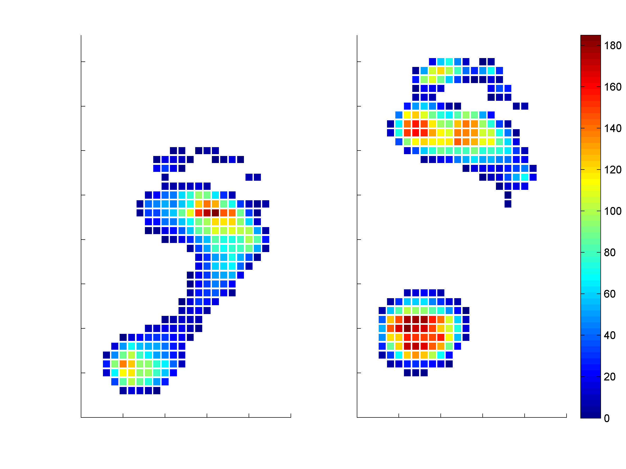
 Figure 18.1Two examples of the mean pressure of a plantar pressure measurements during walking. Color indicates the pressure in kPa
 -
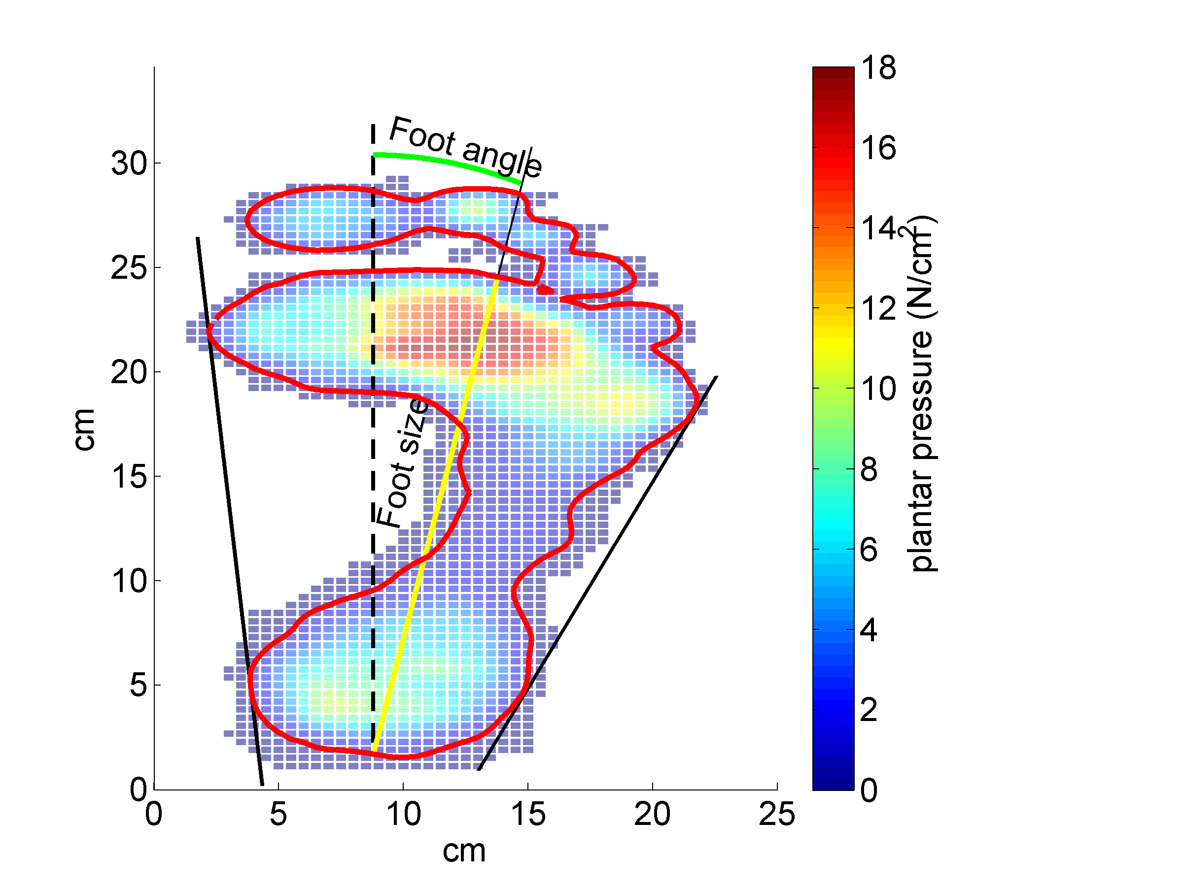
 Figure 18.3Plantar pressure distribution pattern of a subject with the 10 kPa contour line (red line). The middle yellow line indicates foot length and the green curved line the foot progression angle. Black lines on the outside indicate tangent lines. Color indicates the pressure in N/cm2 (1N/cm2=10kPa)
 -
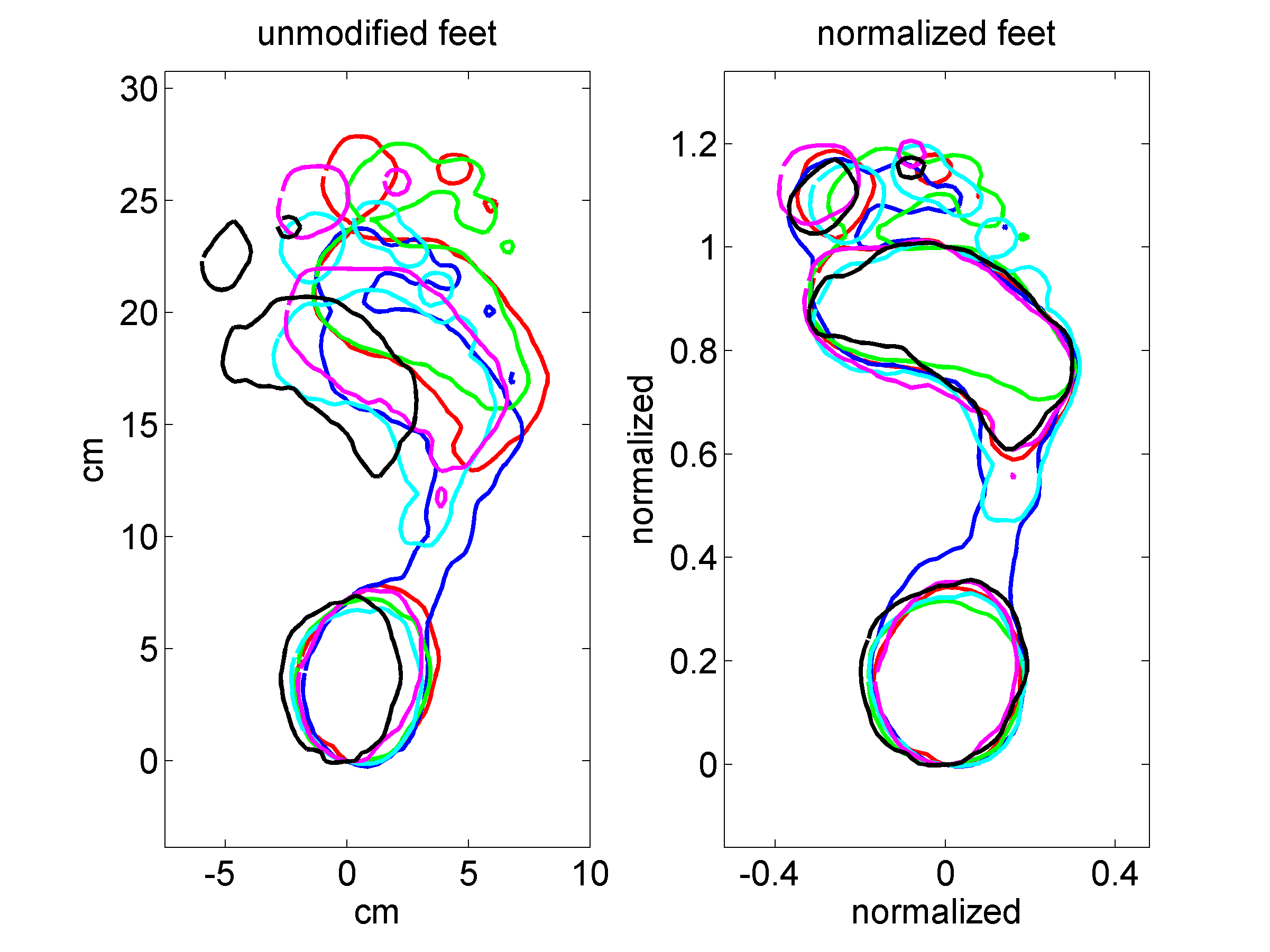
 Figure 18.4Contour lines of 10kPa of 6 randomly chosen feet before (left panel) and after normalization (right panel).
 -
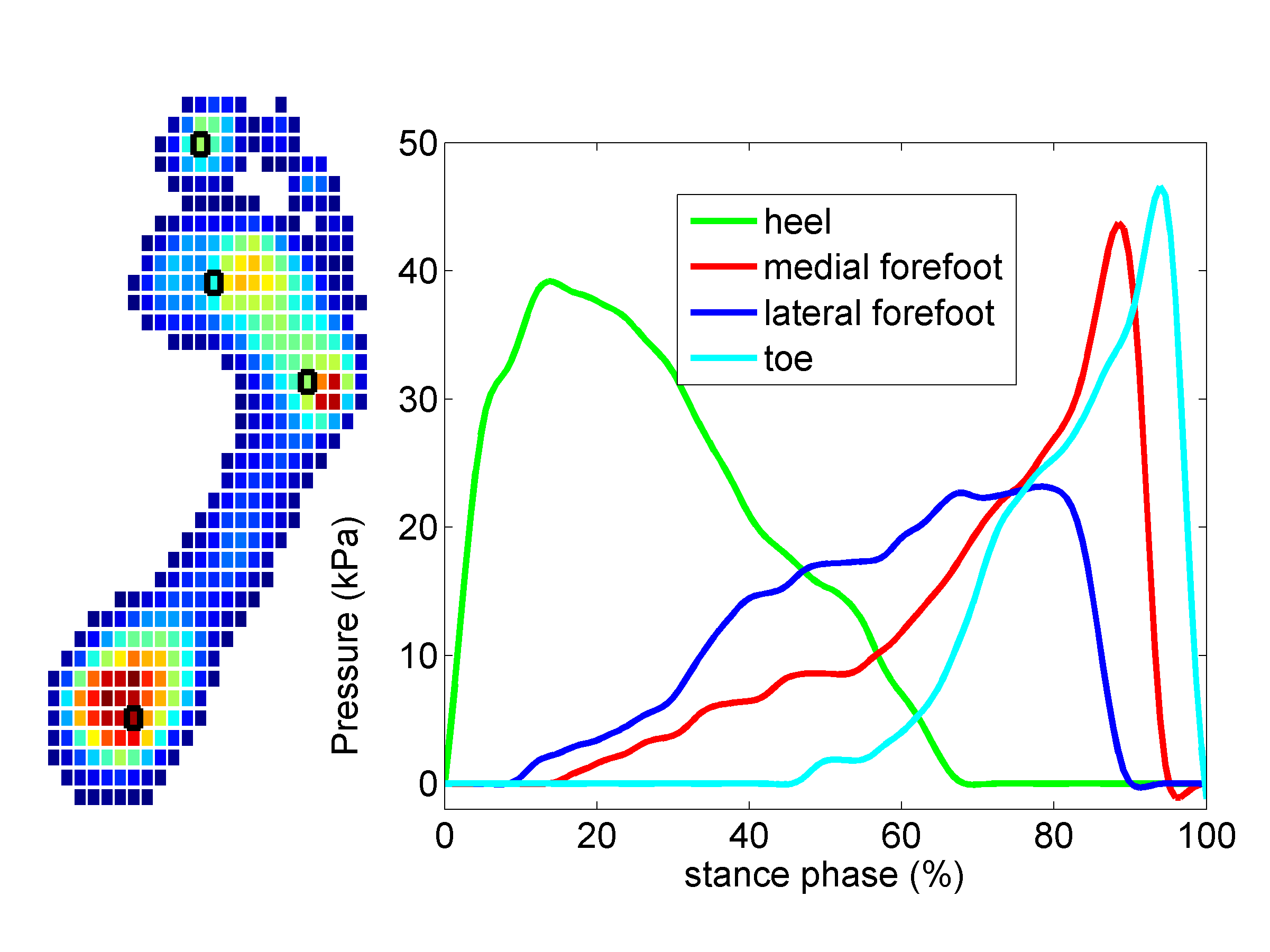
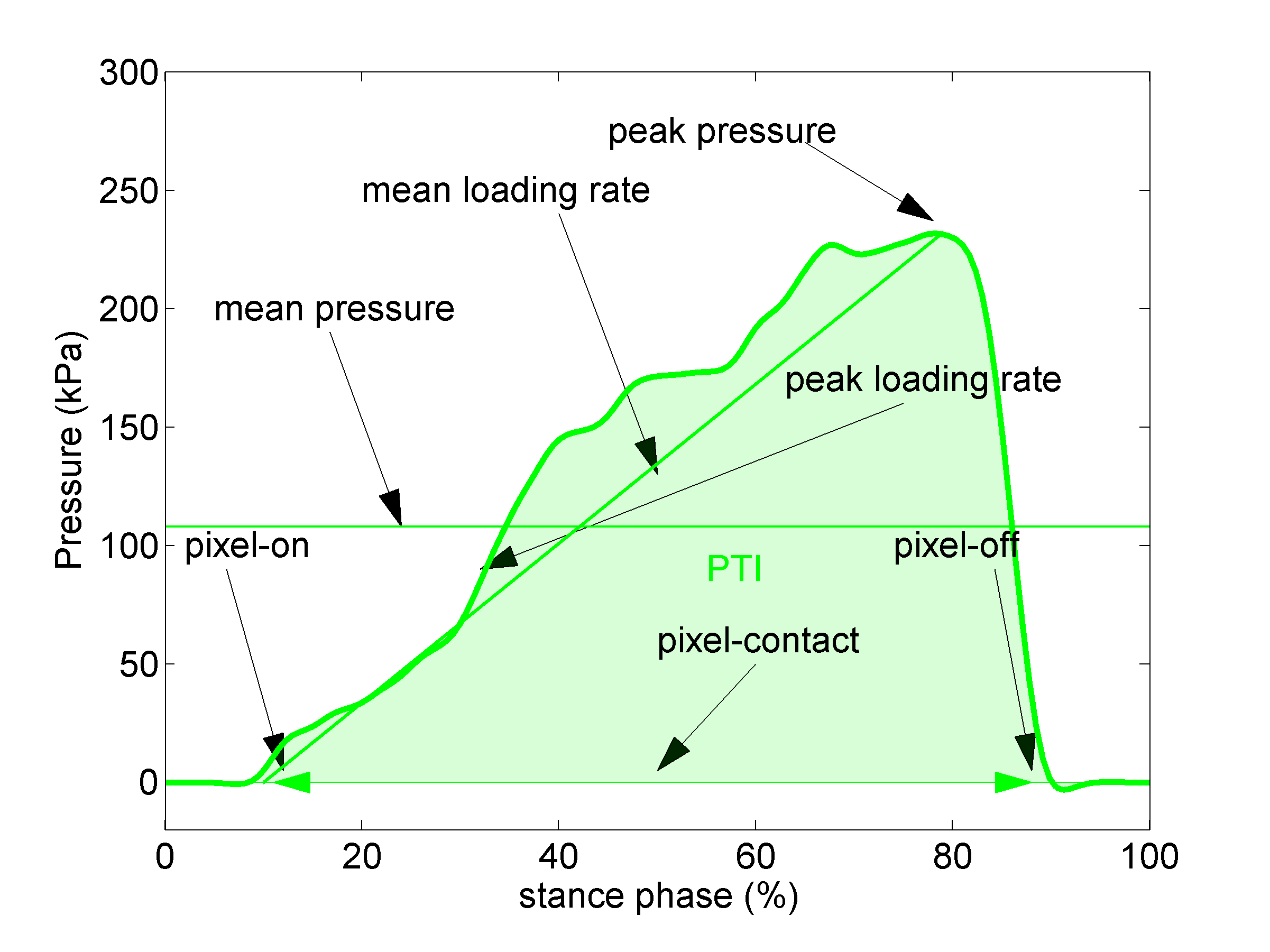
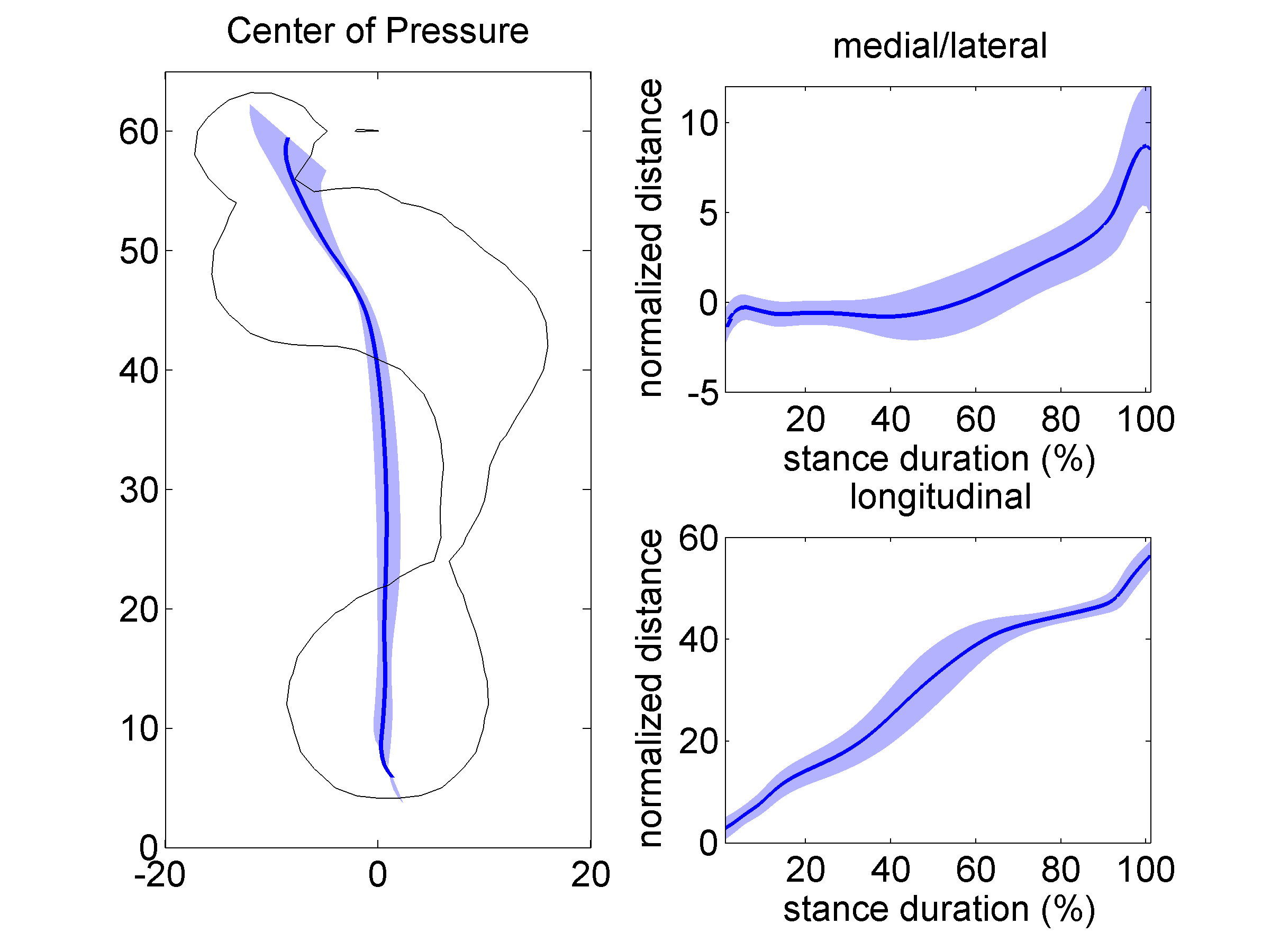
 Figure 18.5Left panel shows a typical example of the mean pressure during walking. Color indicates the pressure. The right panel shows the relation between pressure and time for 4 sensors; heel, medial forefoot, lateral forefoot, and toe.
 -
 Figure 18.6Shoe-last side view
 -
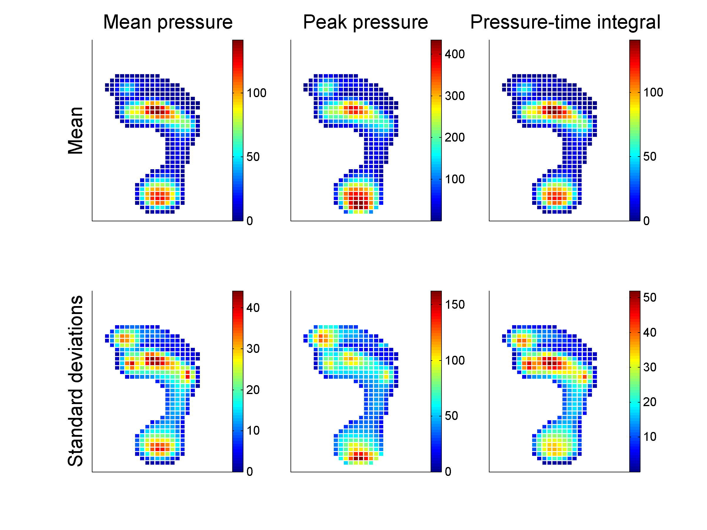
 Figure 18.7Mean (upper panels) and standard deviation (lower panels) of mean pressure, peak pressure and pressure-time integral for 412 subjects. Color indicates the pressure in kPa.
 -
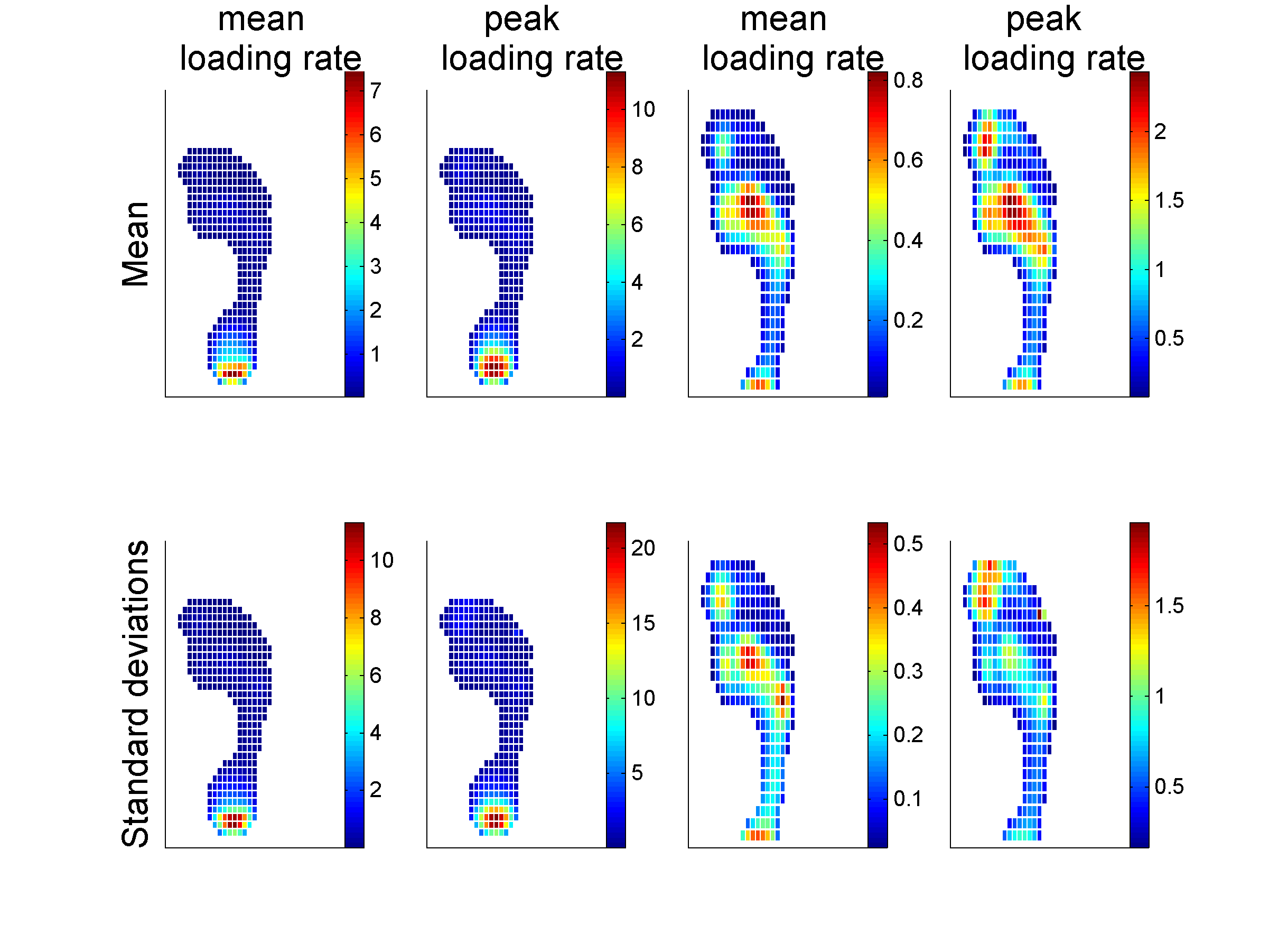
 Figure 18.8Mean (upper panels) and standard deviation (lower panels) of mean and peak loading rate for 412 subjects. Color indicates loading rate in mPa/s.
 -
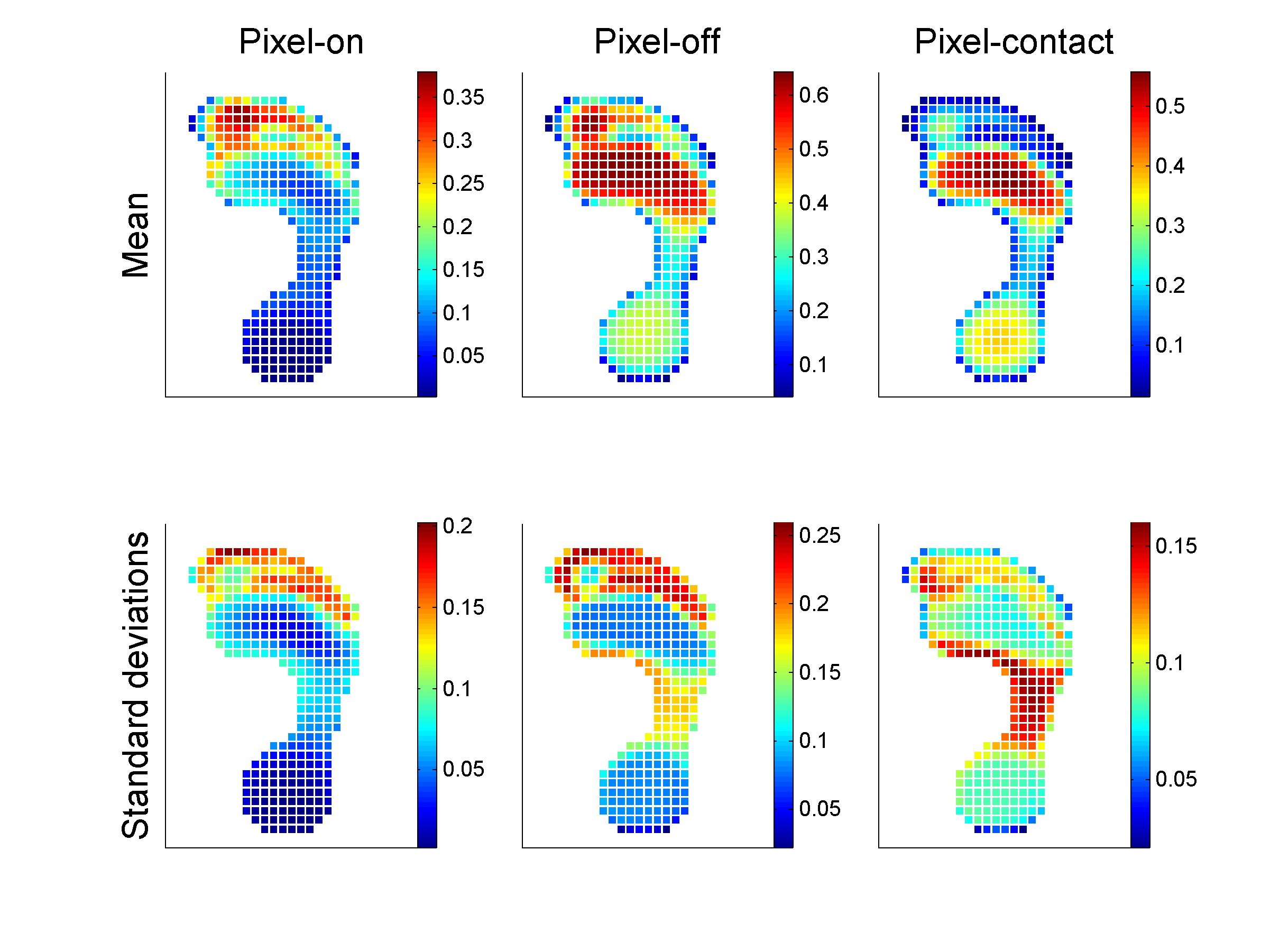
 Figure 18.10Mean (upper panels) and standard deviation (lower panels) of Pixel-on, pixel-off, pixel-contact (see table 1 for definitions) for 412 subjects.
 -
 Figure 18.11Krippendorf Finder
 -
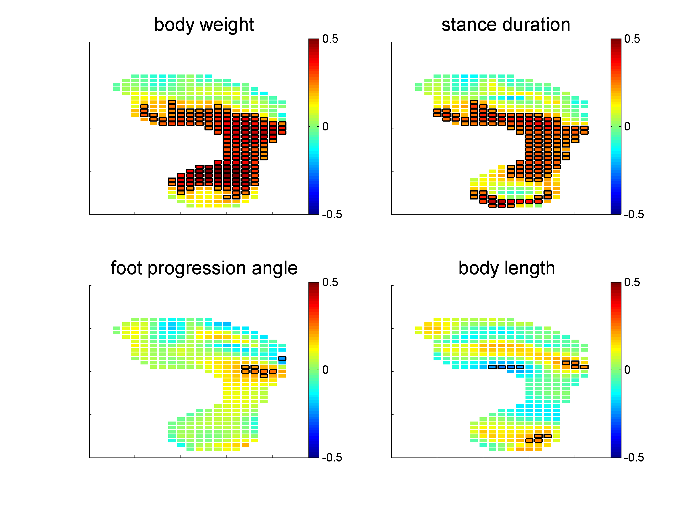
 Figure 18.13Correlation coefficient between mean pressure for each pixel and body weight (upper left panel), stance duration (upper right panel), foot progression angle (lower left panel), and body length (lower right panel). Pixels with a black border have a correlation coefficient larger than 0.22 (5% explained variance).
 -
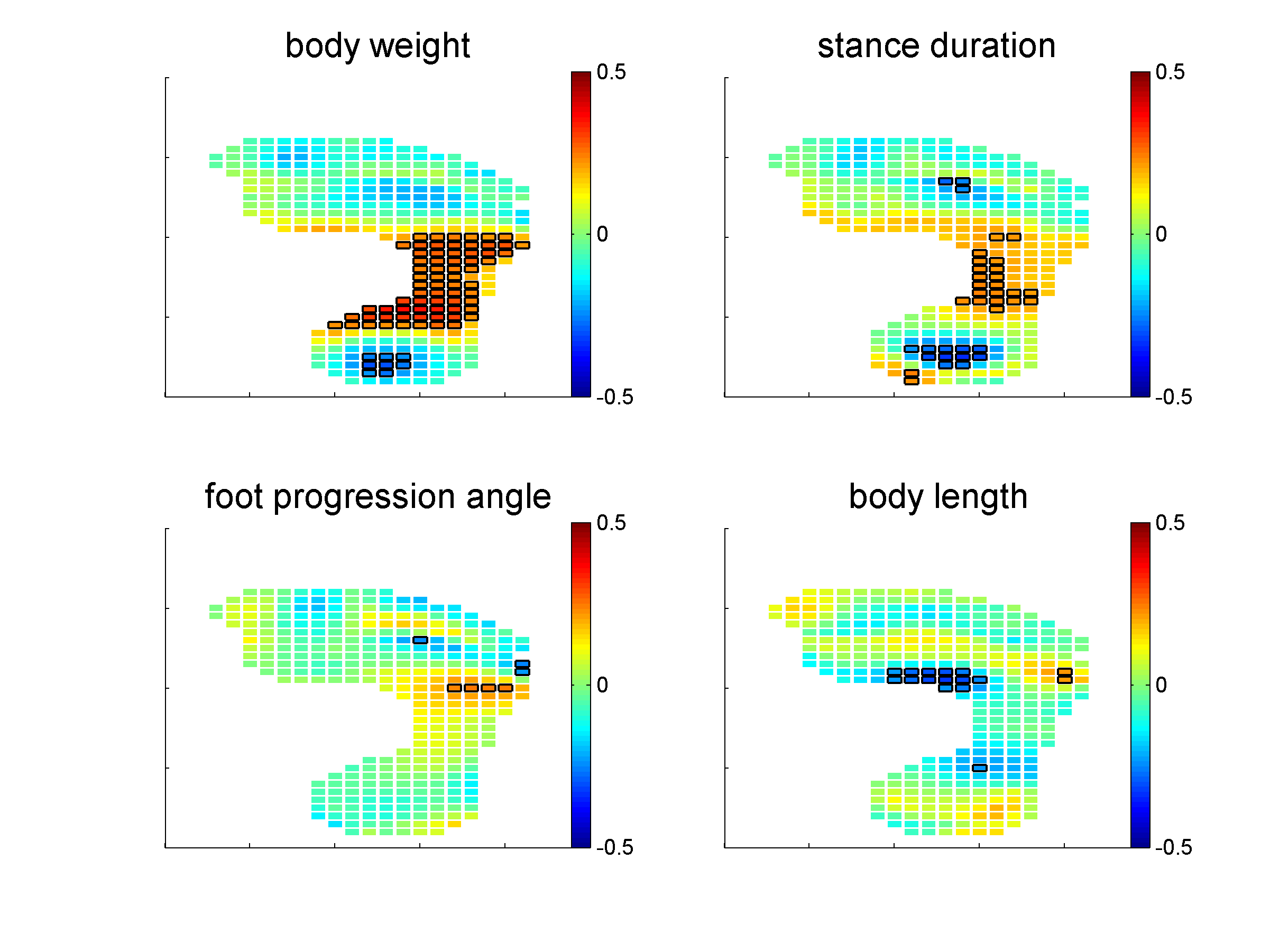
 Figure 18.14Correlation coefficients between mean pressure normalized for total pressure for each pixel and body weight (upper left panel), stance duration (upper right panel), foot progression angle (lower left panel), and body length (lower right panel). Pixels with a black border have a correlation coefficient larger than 0.22 (5% explained variance).
 -
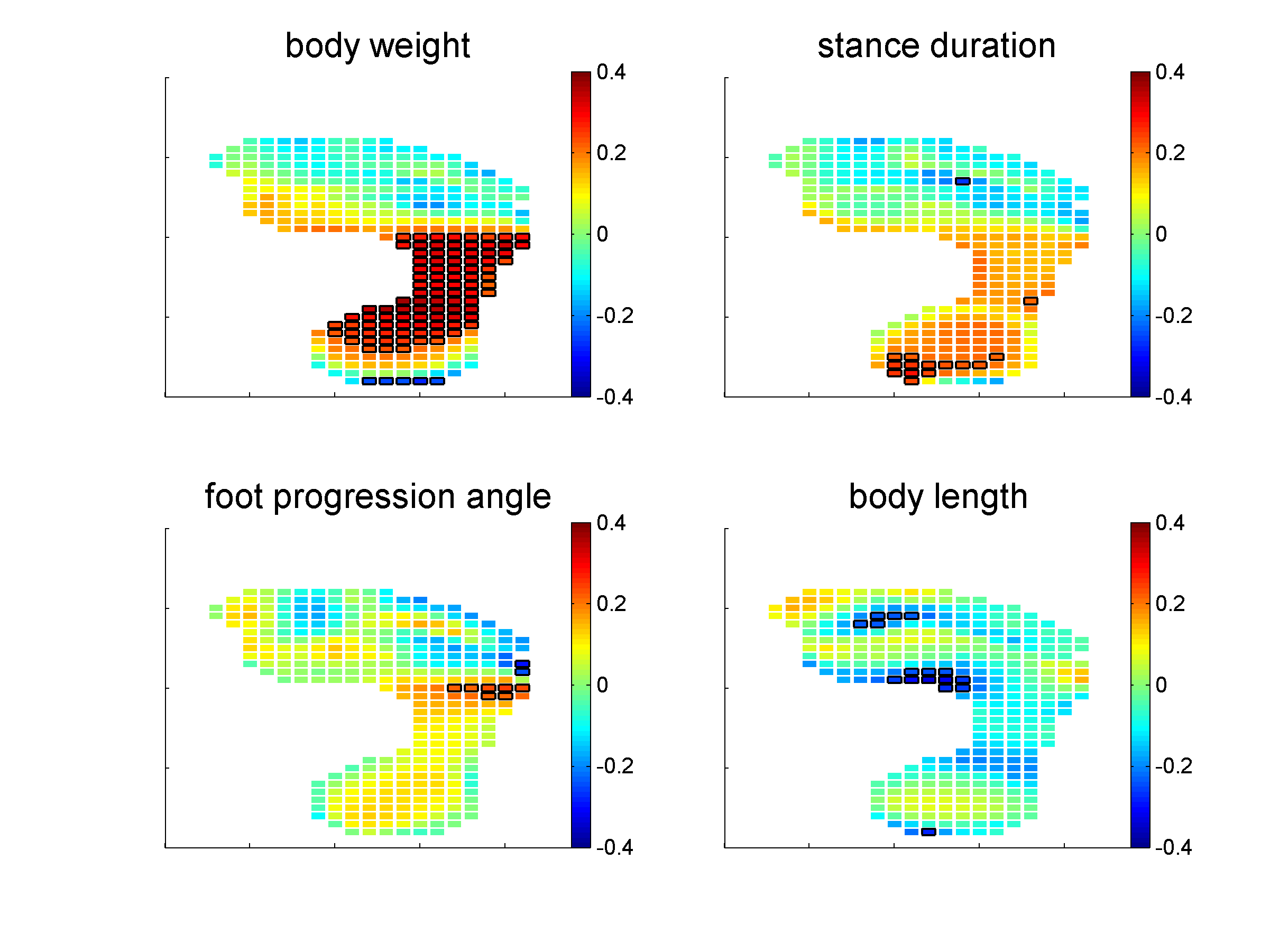
 Figure 18.15Correlation coefficients between contact time normalized for stance duration for each pixel and body weight (upper left panel), stance duration (upper right panel), foot progression angle (lower left panel), and body length (lower right panel). Pixels with a black border have a correlation coefficient larger than 0.22 (5% explained variance).
 -
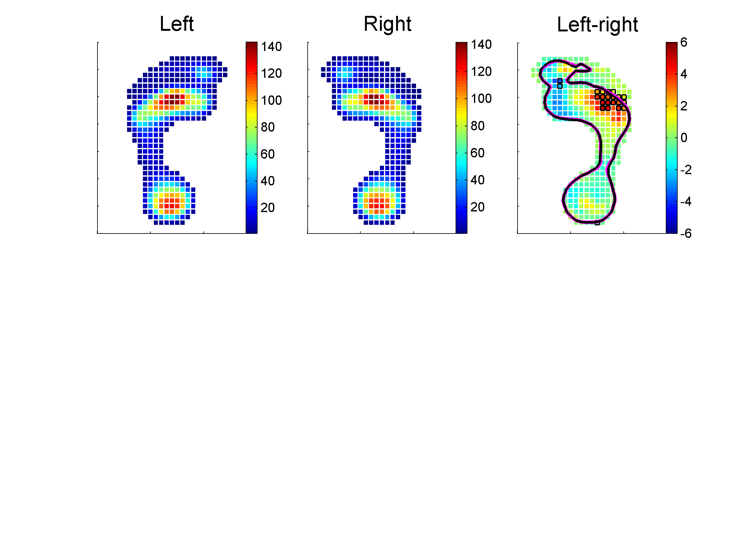
 Figure 18.16Mean of the mean pressure for the left (left panel) and right foot (middle panel). The right panel shows the difference in mean pressure between left and right foot and the 10kPa contour lines of the right (red) and left (black) foot.
 -
 Figure 18.17
 -
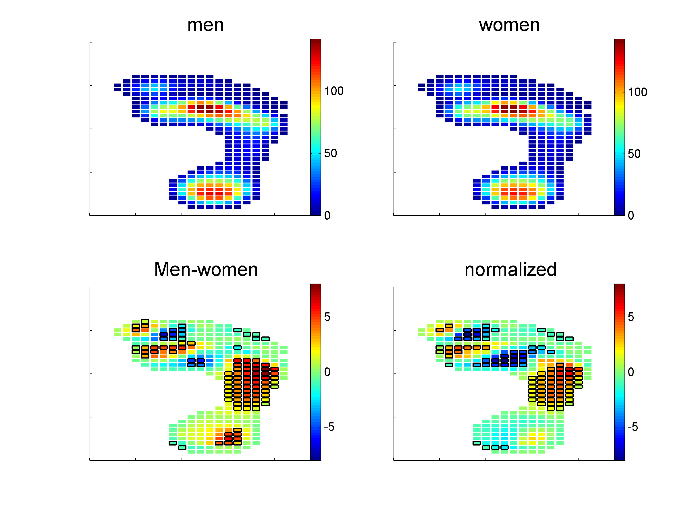
 Figure 18.18Mean pressure image for the men and women (upper panels). The right panels shows the difference in mean pressure between men and women, not normalized (lower left panel) and normalized (lower right panel) for total pressure. Pixels with a black border have a significant difference between men and women.
 -
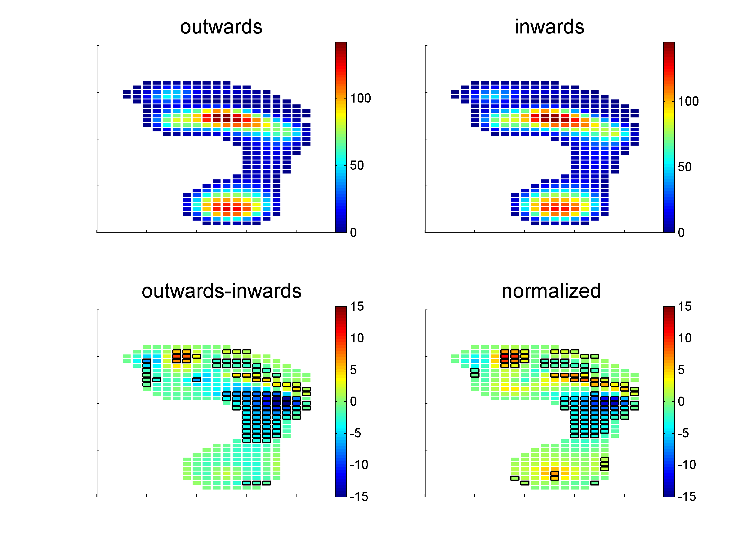
 Figure 18.19Mean pressure image for the outward and inward foot progression angle groups (upper panels). The right panels shows the difference in mean pressure between outward and inward, not normalized (lower left panel) and normalized (lower right panel) for total pressure. Pixels with a black border have a significant difference between men and women.
 -
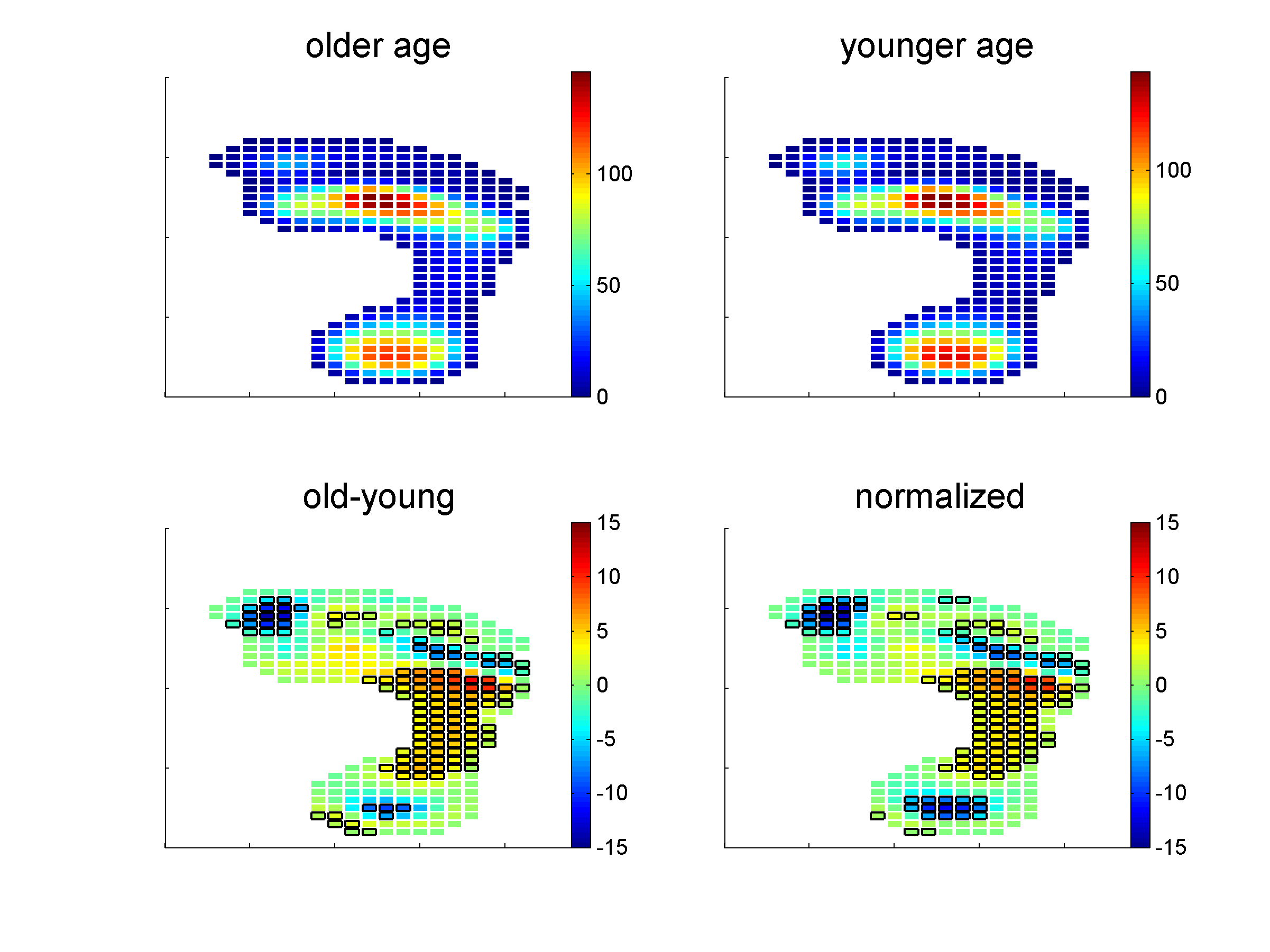
 Figure 18.20Mean pressure image for older age and younger age group (upper panels). The right panels shows the difference in mean pressure between the two age groups, not normalized (lower left panel) and normalized (lower right panel) for total pressure. Pixels with black border indicate a significant difference between older age and younger age group.
 -
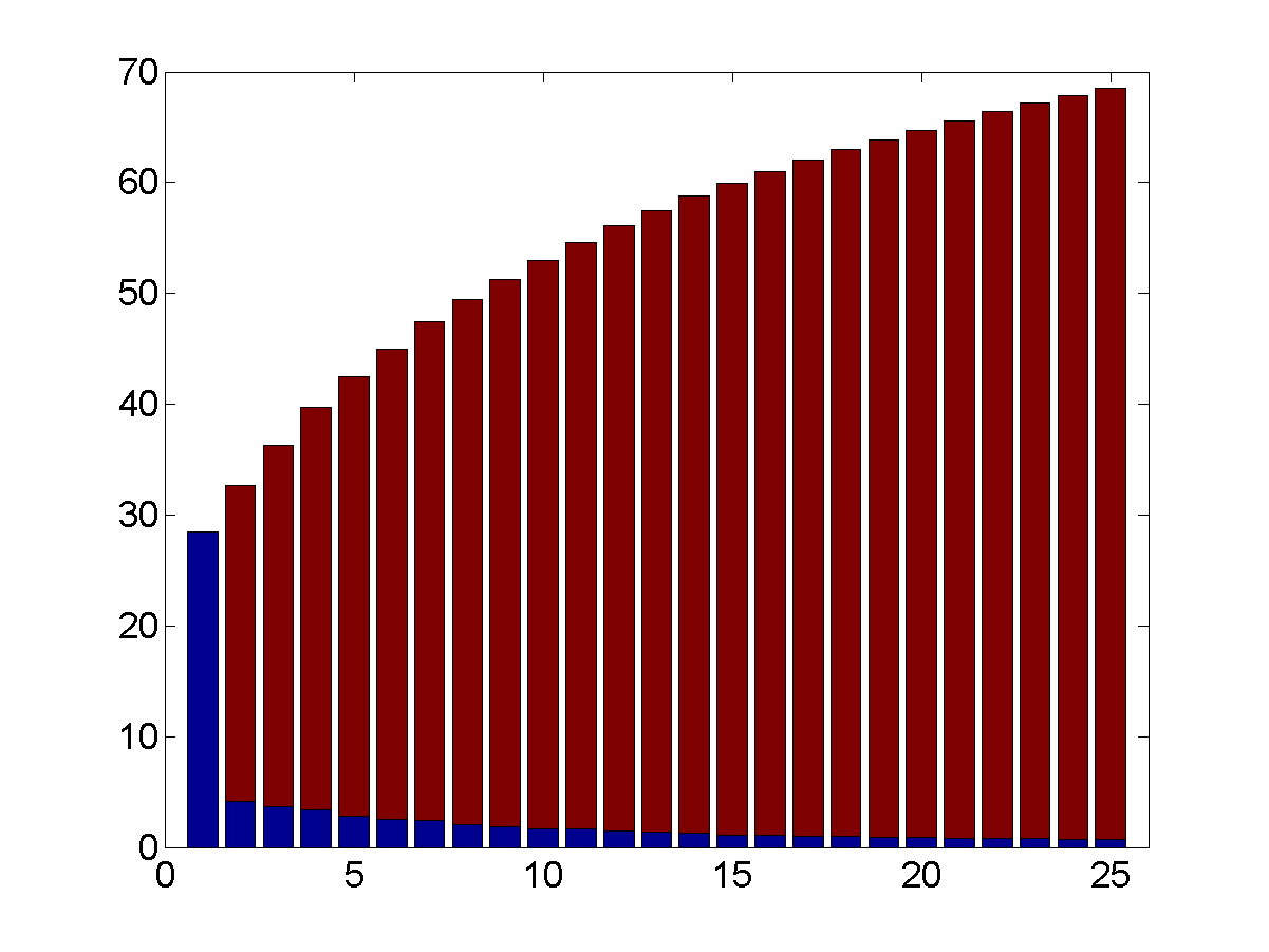
 Figure 18.21Explained variance of the first 25 principal components.
 -
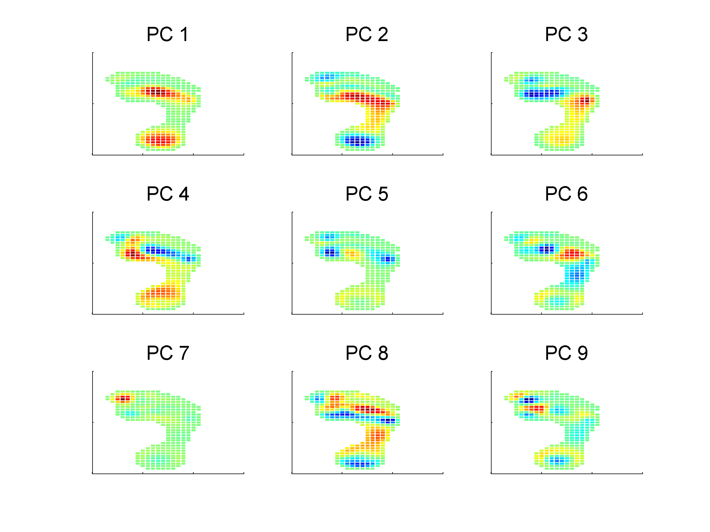
 Figure 18.22Weights of the first 9 principal components. Color indicates the weight.
 -
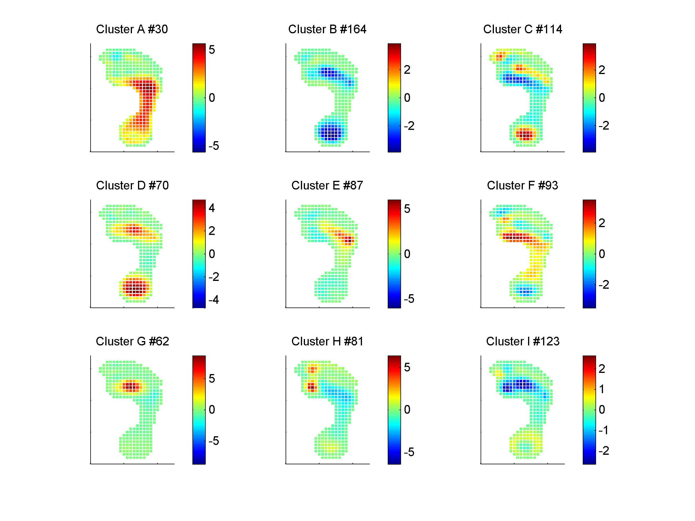
 Figure 18.23Cluster analysis. Data of 412 subjects is clustered in 9 clusters. Figures show the difference between the mean of the subjects in a cluster and the mean of all subjects. Title indicate the number of feet in the particular cluster.